|
|
Post by Horacewimp on Aug 4, 2024 14:04:06 GMT
|
|
|
|
Post by Timeblue on Aug 4, 2024 15:47:22 GMT
In the 1st round I mentioned that I had one in mind that I think is brilliant and 'Perfect World' was that LP!
|
|
|
|
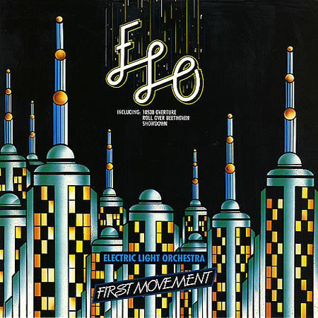
Post by orioles70 on Aug 5, 2024 13:04:11 GMT
The font choice for that 2nd one is probably the ugliest choice for any ELO album, imho. And the skyscrapers look like syringes. #3 is just boring. Runaway win for Perfect World.
|
|
|
|
Post by unomusette on Aug 5, 2024 20:26:18 GMT
I rather like the second one, it's a bit different and it gets my vote. But must agree that the last one is completely yawnsville.
|
|


 ::
:: I'm from Birmingham UK which is Jeffs home city. Been following since about 1970 - was a big big fan of the move and watched them morph into ELO...........been Looking On ever since.