|
|
Post by orioles70 on Apr 14, 2020 20:52:48 GMT
Do we already have a thread like this? didn't find one with a quick search It's the 50th anniversary of the creation of the Rolling Stones lips and tongue logo. The story of how it came about is in the NY Times today. www.nytimes.com/2020/04/13/arts/design/rolling-stones-logo-anniversary.html?action=click&module=Features&pgtype=HomepageIt got me thinking ... What if the artist had met with Jeff and Roy? Instead of a Wurlitzer Jukebox / Spaceship, ELO's logo might have been the Big Brown Fro and Sunglasses. What other favorite rock and roll logos or cover art do forum members like? here's the beginning of the article in case you run into a paywall It began life as a tiny emblem, something to adorn a 45 r.p.m. single or the band’s letterhead. It quickly became ubiquitous and, ultimately, the most famous logo in rock ’n’ roll. Over 50 years, the legendary “tongue and lips” of the Rolling Stones has been emblazoned on everything from T-shirts and lighters to stage sets, appearing in countless variations throughout the decades. And while many who love it are fans of the band, the logo has in many ways transcended the Stones. But when it was commissioned in April 1970 its designer, John Pasche, had little idea how popular — and lucrative — it would become. The logo was to be displayed later this month in “Revolutions: Records and Rebels 1966 — 1970,” an exhibition at the Grande Halle de la Villette in Paris that has been postponed because of the coronavirus outbreak. But I caught up with Pasche, 74, in London by telephone last week, for a glimpse into its back story. (I included other witnesses to its history, as well.) |
|
|
|
Post by BSJ on Apr 16, 2020 17:13:23 GMT
I found this excellent Jackie Gleason album at a record show. The cover is an obscure painting by Salvador Dali.
|
|
|
|
Post by Buttler on Apr 17, 2020 17:25:32 GMT
I found this excellent Jackie Gleason album at a record show. The cover is an obscure painting by Salvador Dali.
Take a look at my new avatar. 
Probably one of my fav...
|
|
|
|
Post by BSJ on Apr 17, 2020 19:54:12 GMT
|
|
|
|
Post by Helmut83 on Apr 18, 2020 6:55:21 GMT
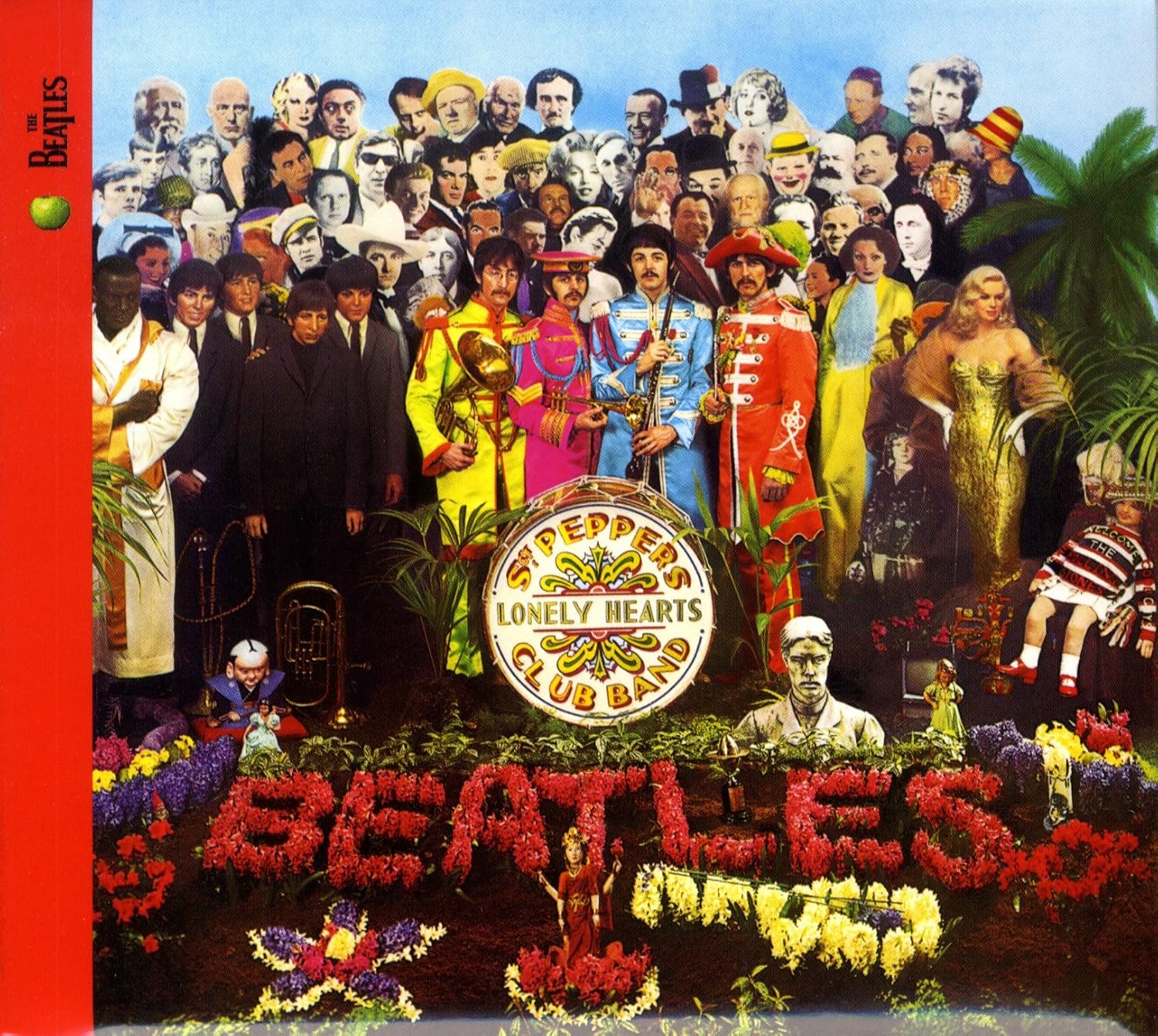
Totally obvious choice, but nonetheless epic: the Beatles' "Sgt Pepper's...". Every time you look at it you notice details you hadn't seen before.  |
|
|
|
Post by Horacewimp on Apr 18, 2020 7:21:23 GMT
Simple design but effective.  |
|
|
|
Post by BSJ on Apr 18, 2020 16:59:33 GMT
|
|
|
|
Post by BSJ on Apr 18, 2020 18:10:49 GMT
On the Gleason cover I think they did a great job with the lettering complementing Dali's painting, and all sticking to the theme of the albums name. I love the use of letters on these two. |
|
|
|
Post by Helmut83 on Apr 18, 2020 19:05:16 GMT
Monkees, far better. Led Zeppelin is just a nice font.
|
|
|
|
Post by queenofthehours on Apr 20, 2020 18:12:57 GMT
The Sgt Pepper cover is iconic but until a few years ago I always thought it had been put together flat like a paper collage rather than actually using the life-size pictures in 3D.
The OMD cover is a favourite of mine, one of Peter Saville's best.
|
|